Wednesday, 30 January 2013
Task:Report about Helvetica
What i really understand about this video is about a typeface named Helvetica which was formed in 1957 by Swiss typeface. Helvetica is a sans-serif typeface which generally will use for inform something or to convey, communicate, extend, pass the message or information as well. As i know Helvetica is a typeface which is very neat to see, and Helvetica mostly used for a magazine advertisement ,bag designs and so on. If type of Bold Helvetica should be can use to form a word like 'Flyers',may be it's look cute,said by one of the Design writer. Overall, what i can say about the typeface Helvetica is a typography which represents a simple form of art.
Monday, 28 January 2013
intro to typo: week 3(create a font using the nature materials)
Typography : My creation
intro to typo:Font that represent myself and description
Typography
Task
1:Font identification
SHARON SHAMLA
(French
script MT)
The reason why i chose this font is because the
lines and the curves of this font has impressed me a lot and its represent myself as well. The
first thing that i can tell about this font is it looks very classic and girlish.
Its mean that in ancient times, people often use this kind of font to write a
letter or revelation using the feather and ink writing on the papyrus to convey
such information to another person. Sometimes this kind of font are often used
in wedding decoration, which will be displayed at the main place of that
wedding,we also can see this type of font on the birthday invitation,graduation and so on. Other
than that,the curve of this font looks like a kind of woman’s body shape which represent me and as we all know
that no body is perfect in this world,so what i think is the font i had chosen
is not a perfect font.I said this because when we look at the letter ‘o’ we can
see that the letter is not
perfectly joined circle.I don't expect
something really very perfect .For example,i dont want to be a perfect girl
with a perfect height,weight, size and color,i just will appreciate with what i
have.
Tuesday, 22 January 2013
intro to typo:week 2(typo design)
What is Typography
What i think about typography is a style or appearance of a printed matter. Typography is quit interesting to learn because,through that we can know the history of the ancient egyptians. I got to know many things about typography which i learned today in the class. As i know typography is a communication between all of us. Sometimes we don't even to speak out and we can understand the purpose and meaning of the typography by look at the signs. I expect to know many more things and gain knowledge in typography.
My Typo Design
Simple and ancient, this is shows that i love something very classic .And the lines i used, is very thin lines which is represents myself and it looks girlish too.Overall it shows that Im a simple girl and the joining of the long lines,represent my long hair.
intro to typography: week 1
The final outcome of the pictograph icon (washroom sign)
group work with (Li Feng and Chumba kakubo)
graphic design part 1:week 2
The three geometric shape of object i had chosen
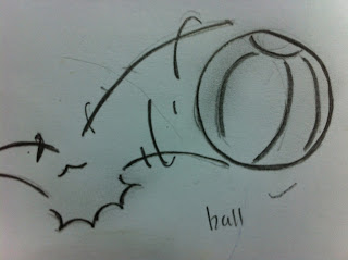
This icon was created by Ifti Qar,it is a icon of a bouncing
ball which have to draw using a circle shape. He is so creative in drawing this icon of
bouncing ball, which he used the energy of action in sports .When i see this icon,
it is remind me the seven basic principles of animation which i had learned in basic
animation subject in my first semester of foundation. The forced of the ball
bouncing was look quit real. Maybe if the icon are color up ,its look more
realistic. Whatever but still the icon are looks simple and nice.
This icon was formed
by Li Feng, The following icon is the result of the shape of the pyramid.
The icon shows a piece of cake which looks so colorfull. The reason that i choose this image because i
love to eat cake.The color of this icon attract
the audience such as ,the red color is like focus point which make me to look
at that. The cherry which is place on top the cake are impressed me a lot,
that's not to say because i love that,i said so because its look cute and
delicious. Another thing that i like the most in this picture is ,he
formed a 3D design using the pyramid shape.
This icon was drawn by Desmond Wong . It is a scale ruler of
triangle shaped,and triangle is one of the basic shapes of geometry a polygon with three corners or vertices and three sides or edges which are line segments. A central theorem is the Pythagorean
theorem, which states in any right triangle, the square of the length of the hypotenuse equals the sum of the squares of the lengths of the two
other sides. Ruler
are very useful to every human being in doing some measurement or to
create a straight line. I like this icon because, the creativity of this person
in form a image using a geometry shaped is very smart.
Monday, 21 January 2013
Subscribe to:
Comments (Atom)


.jpg)

.jpg)


